Projects Detail

Explore the brands we’ve partnered with and the digital solutions we’ve delivered — from strategy and branding to websites and performance marketing.

Design, Other
February 10, 2026

MITSO – Bold, Flavour-Focused Packaging Identity

MITSO approached us to develop a modern packaging design system that would clearly communicate freshness, flavour, and product quality. The goal was to create a cohesive visual identity that stands out on shelves while reinforcing the brand’s premium positioning.

We crafted a flavour-led packaging system built around strong colour direction, structured label layouts, and clear messaging hierarchy. Every element — from typography selection to product information placement — was designed to ensure maximum visibility and brand consistency across the full product range.

Business & Creative Objectives

Develop a modern, shelf-ready packaging design system
Communicate freshness and quality clearly through visual design
Create strong flavour differentiation through colour strategy
Establish clear label structure and product hierarchy
Ensure consistency across multiple product SKUs
Strengthen brand recognition in competitive retail environments
Balance bold design with clarity and compliance
Build a scalable system for future product expansion
MITSO Mockup

Our Proven Approach To Designing The Packaging

We combined strategic brand thinking with structured packaging design to ensure MITSO’s products stand out while maintaining clarity and cohesion.

Brand & Market Positioning
We analysed the competitive landscape and defined a packaging direction that reflects quality while differentiating MITSO within the market.
Visual System & Label Development
We developed a cohesive packaging system including colour coding, typographic hierarchy, and structured label layouts for clarity and shelf impact.
Application Across The Range
The design system was implemented across the full product range to ensure visual consistency while maintaining clear flavour differentiation.

Results & Impact

Bold colour direction and clean structure create high visibility in retail environments.
Structured label hierarchy ensures freshness, flavour, and quality are communicated instantly.
A unified packaging system strengthens MITSO’s overall brand identity.
The system allows for easy extension into new flavours and future product lines.
MITSO Mockup
MITSO Mockup

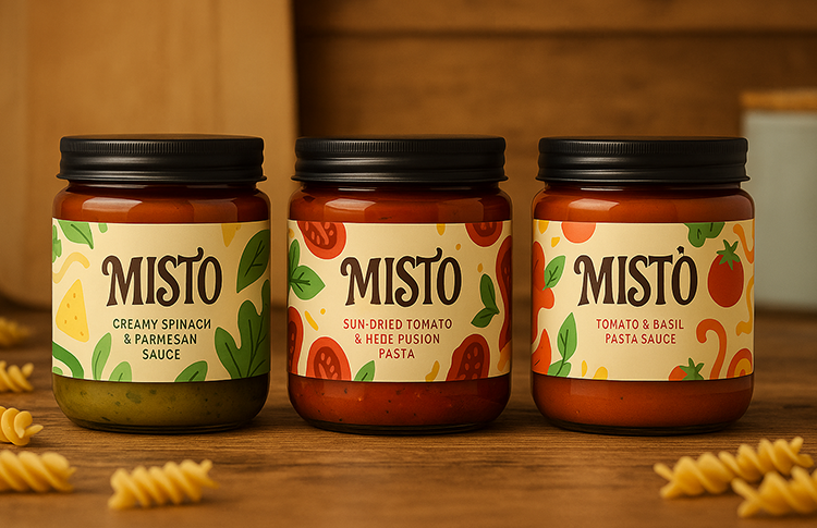
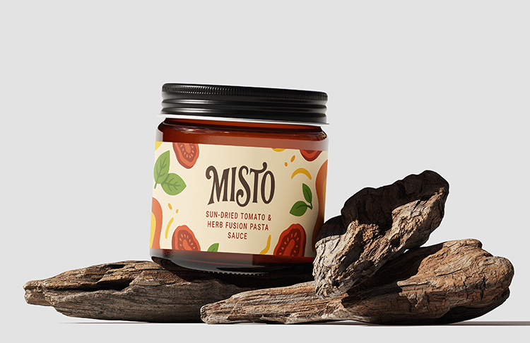
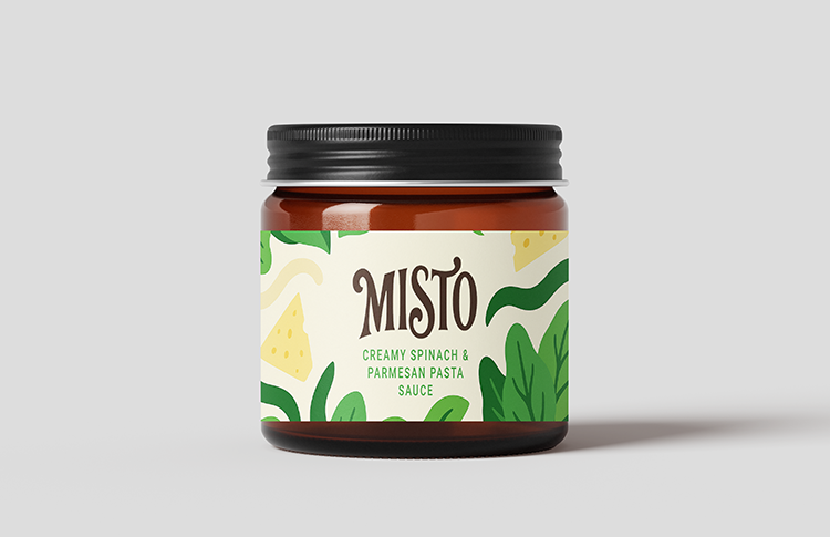
We created a modern, flavour-focused packaging design system for MITSO designed to communicate freshness, quality, and clarity at first glance. By establishing a bold colour strategy, structured label hierarchy, and refined typographic system, we ensured every product maintains strong visibility while reinforcing the brand’s premium positioning. Each design decision was made to balance visual impact with clear communication across the full range.

Built with scalability in mind, the packaging framework allows MITSO to expand into new flavours and product variations while maintaining cohesive brand consistency. From shelf impact to brand recall, the system delivers a confident, market-ready presence that feels modern, refined, and commercially strong. The result is packaging that not only stands out but supports long-term brand growth.